Design and implementation of Cog's marketing website

BRAND

Cog ADHD

Cog ADHD

Cog ADHD

SUMMARY

I led the design and development of cogadhd.com, enhancing the existing brand and creating a strategic content plan. I developed a new website concept that delivers an experience tailored to diverse audiences.

ROLE

IA

Strategy

UX/UI

Development

DURATION

2 months

TOOLS

Figma

Webflow

Notion

SETTING THE STAGE

Cog is a mental healthcare startup offering self-help tools and specialist assistance through a mobile app. The existing website lacked clarity and didn’t address the needs of both personal users and businesses, making a redesign essential to align with the brand’s goals and improve engagement.

MY ROLE

I led the design and development, collaborating with stakeholders to align on business goals, tone, and content strategy.

I restructured the information architecture to effectively communicate Cog’s offerings for both B2C and B2B audiences.

I refined the visual language to elevate the brand, balancing professionalism with Cog's vibrant and approachable identity.

I translated the design into a fully responsive website using Webflow, ensuring seamless UX across devices.

Strategy

Strategy

A big part of this project was focused on strategy as well as visual design. Cog started as a personal-use product, but we realised more and more forward-thinking companies were recognising the importance of supporting their neurodiverse audience. They were interested in partnering with products like Cog, which pushed us to expand our offering to businesses. This shift meant the website needed to cater to two very different audiences.

My work started with talking to various stakeholders, the founder and sales. We wanted to align on Cog's business goals, differentiating factors, value proposition, competitive advantages, as well as its brand and tone.

Objecives

Defining success for cog's new website

Brand awareness

Help visitors see Cog as an industry leader and inspire interest in exploring the product further.

B2C Conversion

Encourage visitors to download the app and sign up for a subscription or trial, creating an easy path for engagement.

B2B Lead generation

Attract qualified leads and encourage demo bookings, focusing on building partnerships.

Methodology

Deep dive into our audience

One of the most challenging aspects of this project was the need to appeal to two distinctive audiences—personal users and business leaders looking to incorporate Cog as a part of their EAPs.

I created various personas based on feedback from stakeholders on both sides.

Targeted personas

B2B vs B2C: Tailoring the Experience for Different Audiences

Personal users

The design focused on guiding users to easily understand the product’s value and take action by downloading the app. The tone was professional yet friendly, reflecting Cog’s emphasis on positivity—helping users see ADHD management as empowering and achievable. Social proof, including customer reviews and press mentions, was strategically placed to build trust and encourage conversions.

Comapnies

The focus shifted to the business impact. I structured the content to appeal to decision-makers, providing them with the information they needed to see the value of integrating Cog into their organisation, with clear CTAs prompting demo bookings. We positioned Cog as a tool to support neurodiverse employees, boosting productivity, reducing absenteeism, and fostering inclusivity.

visual design

Maintaining and Enhancing the Brand

Cog has a strong, vibrant brand built around positivity and energy. The illustrations and mascot, "Scriggly," distinguish it from competitors and are loved by our users. My goal was to ensure brand consistency by reflecting the brand’s colors, illustrations, and tone of voice on the website.

In the app, we are mindful of the brand's color usage, aiming for a dynamic yet peaceful user experience. On the website, however, I took a bolder approach, incorporating more vibrant brand colors, illustrations, and graphics to make Cog stand out and capture attention."

In the app, we are mindful of the brand's color usage, aiming for a dynamic yet peaceful user experience. On the website, however, I took a bolder approach, incorporating more vibrant brand colors, illustrations, and graphics to make Cog stand out and capture attention."

SCALABLE DESIGN

Blog posts driving engagement and brand awareness

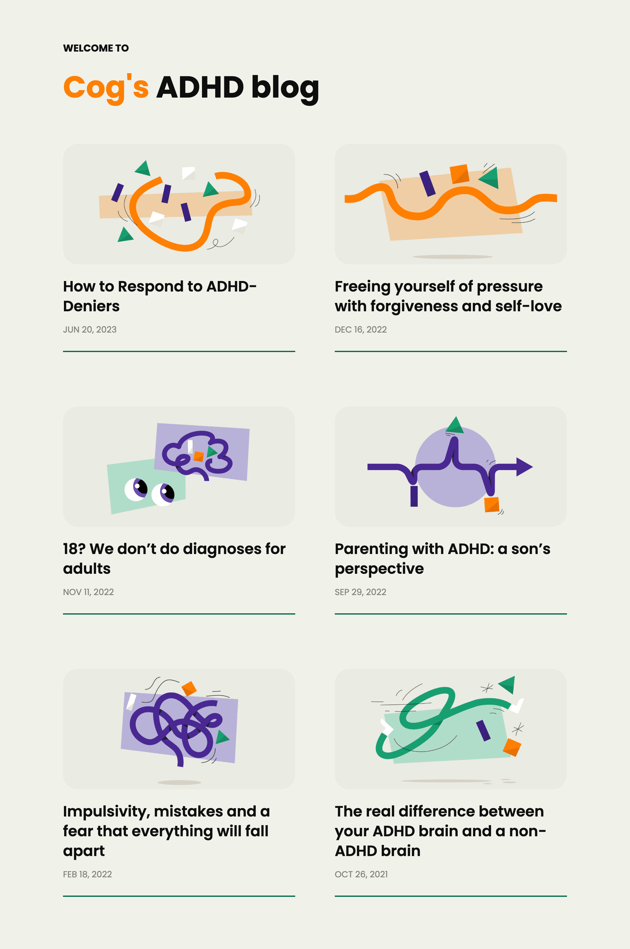
To further drive engagement and strengthen Cog’s online presence, I integrated our existing blog content into the website. Originally hosted on Medium, these posts—created by Cog’s founder and other ADHDers—had already proven successful in driving traffic through in-app links and search engines. In fact, some customers first discovered Cog through these blogs, highlighting their role in our content strategy for user engagement, brand awareness, and as a step in the conversion funnel.

I developed the blog page using Webflow CMS, enabling new content to be added without requiring a designer. With a pre-set layout, contributors can easily publish blogs independently. The page is scalable, ensuring it can grow alongside the brand’s content needs.

I developed the blog page using Webflow CMS, enabling new content to be added without requiring a designer. With a pre-set layout, contributors can easily publish blogs independently. The page is scalable, ensuring it can grow alongside the brand’s content needs.

EXECUTION

Building expertise in Webflow

To bring the new design to life, I developed the website using Webflow. This included:

#01

Implementing responsive layouts to ensure seamless functionality across devices.

#02

Developing CMS-powered sections, such as the blog, to allow for scalable content updates without additional design input.

#03

Adding interactions to enhance user engagement and guide visitors through key content areas.

#04

Optimising SEO by adding alt tags to all images and creating meta titles and descriptions

This was my first large-scale project in Webflow, and I had to learn and adapt as I built the site. It was a fun and challenging experience that tested my ability to acquire new technical skills and deliver results under tight deadlines.

Challenges

Lack of analytics and establishing tracking systems

One of the key challenges was the lack of detailed analytics on the old website, which made it difficult to identify pain points or benchmark performance for future improvements.

To address this, we integrated Google Analytics to gain visibility into website traffic and user behaviour. We created tracking tags for key CTAs, such as app downloads and demo bookings, to collect actionable data post-launch. We also added UTM parameters to external links, such as those on Instagram and LinkedIn, to track traffic sources and improve insights.

Key Takeaways

Designing with strategy and marketing in mind

Strategic collaboration and research play a key role in aligning goals and creating user-specific content.

Marketing design's ultimate goal is to drive conversions, so every element must have a clear and strategic purpose.

Analytics are crucial for understanding a website's performance and identifying areas for improvement.

looking forward

Tracking Metrics for Success

To measure the success of this project, I need to track metrics tied to each goal. This will help identify what’s working, uncover areas for improvement, and establish data-driven benchmarks to refine the site’s performance over time.

Brand Awareness

Metrics to Track:

Metrics to Track:

Metrics to Track:

Monthly website visits, average time spent on the site, bounce rate.

Goal:

Goal:

Goal:

Measure how effectively the website is attracting visitors, as well as how engaging the content is.

B2C Conversion

Metrics to Track:

Metrics to Track:

Metrics to Track:

Click-through rate for download buttons, conversion rate from clicks to app downloads.

Goal:

Goal:

Goal:

Measure how well the website converts individual visitors into app users.

B2B Lead Generation

Metrics to Track:

Metrics to Track:

Metrics to Track:

The number of companies reaching out via the website

Goal:

Goal:

Goal:

Measure the effectiveness of B2B-focused content in generating qualified leads.

visit cog's website here

visit cog's website here

visit cog's website here

Caroline Jaworsky

LET's connect

I find great joy in working with others and testing my skills in new environments. Whether you would like to collaborate on a project or simply want to chat, feel free to reach out to me.

Reach me here

linkedin.com/in/carolinejaworsky

jaworskycaroline@gmail.com