summary
cashu is a mobile platform designed to help young people take control of their financial wellbeing.
setting the stage
During my time in a Product Design Bootcamp, I had the opportunity to work on a project of my choice that covered the full end to end UX process, from discovery to high fidelity prototype.
My role
Research, UX, UI, Brand
Tools
Figma, Adobe Ai, Ps
Duration
8 weeks
The solution
HASSLE-FREE MONEY MANAGEMENT
PRODUCT
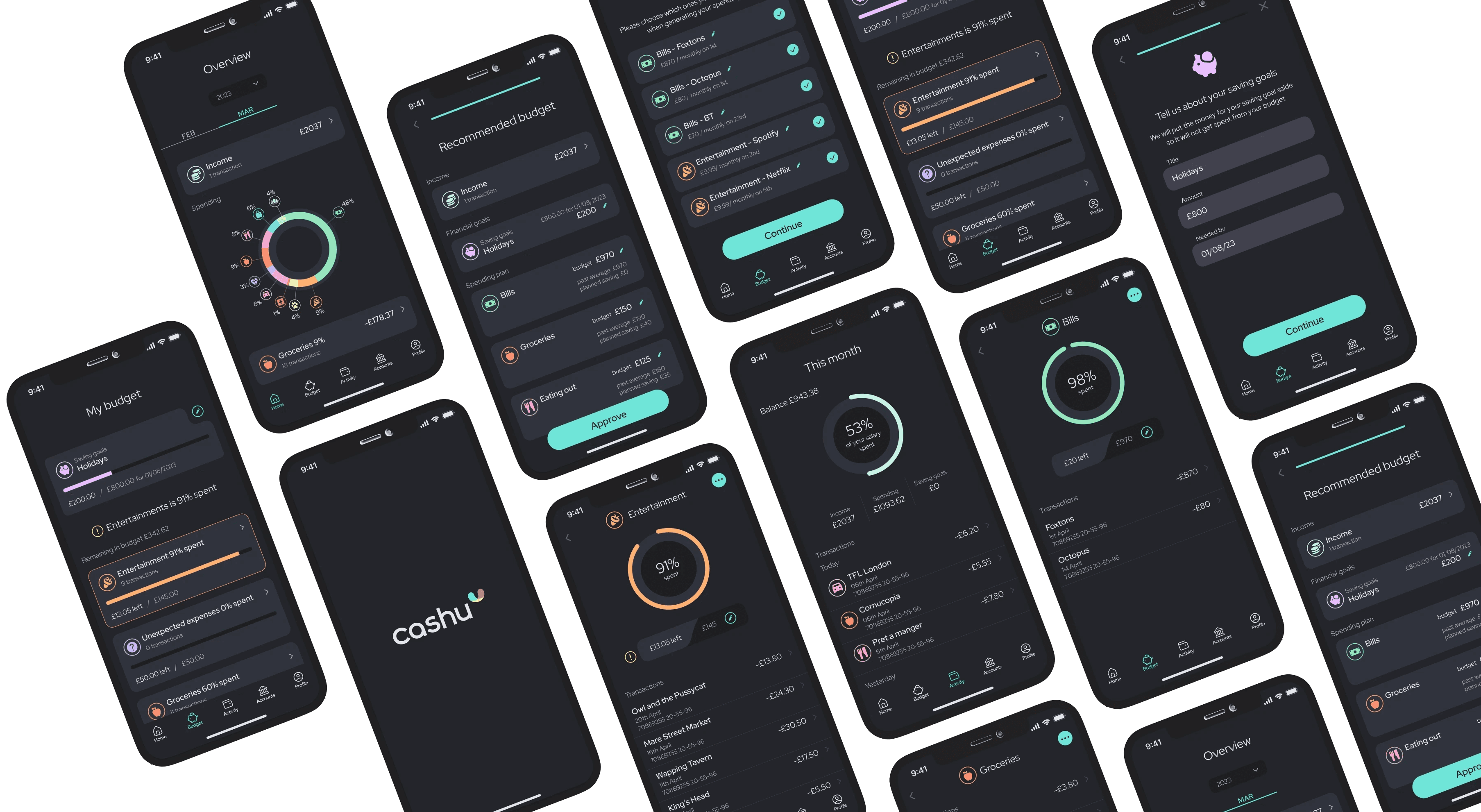
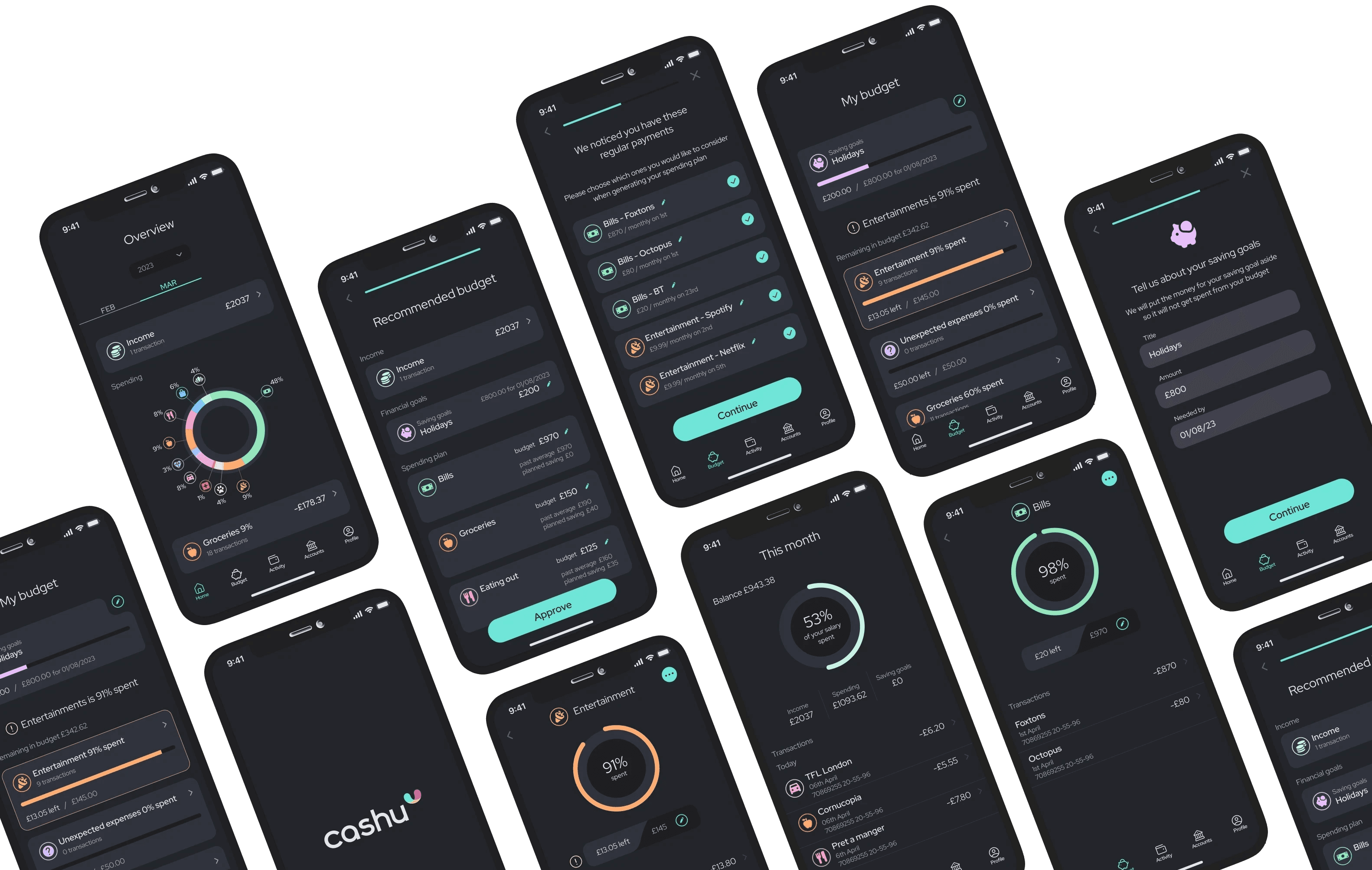
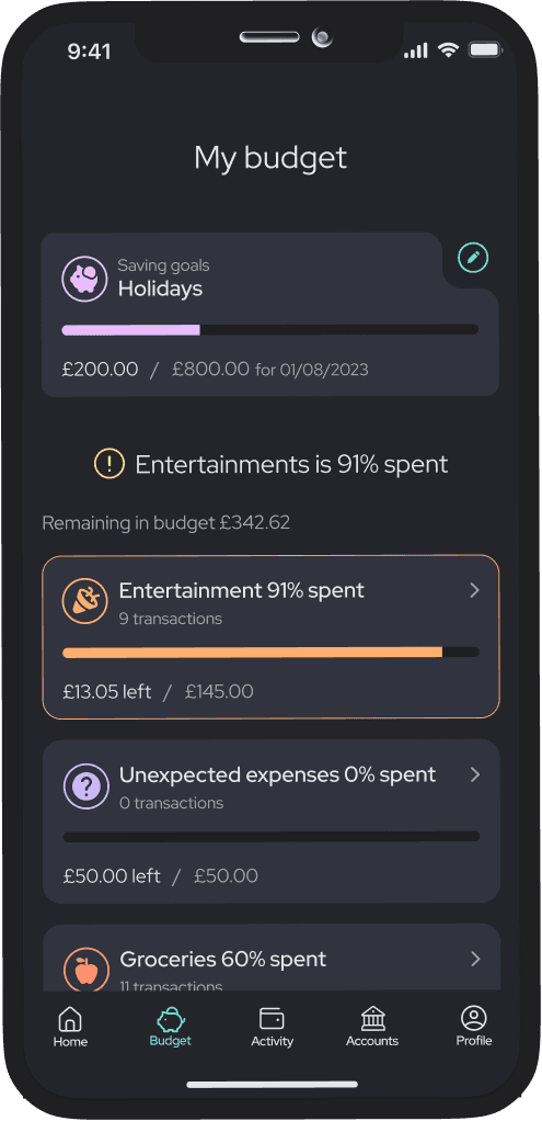
cashu is an intuitive personal finance app that leverages AI to help users manage their money with confidence.
It removes the guesswork by tracking income and expenses, then auto-generating and adjusting budgets based on user behaviour and spending patterns.
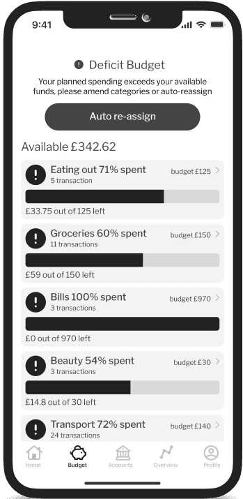
When unexpected spending occurs, cashu helps users stay on track with its automatic budget reassignment feature.
BRAND
cashu is more than just a functional product. It is designed to be a tool that users would genuinely enjoy using.
A modern and playful, yet professional brand aims to resonate with the young target audience.
The choice of the name, logo, typography, and colour palette all embody the essence of cashu – a fun and easy financial companion.
Research
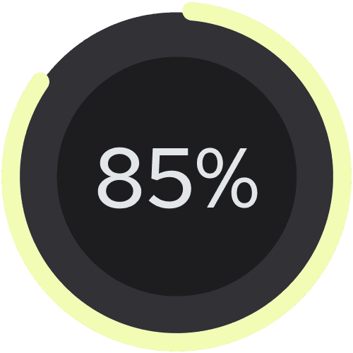

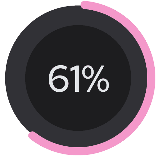
say their life would improve with better money managment
To dive deeper into the problem I spoke to five adults between the ages of 18 and 25. I wanted to understand which areas of personal finance they struggle most.
Nigela
She is a 19 year old student who knows a few things about finance but struggles to apply that knowledge. She doesn’t plan or track her spending and often shops impulsively. She tries to put money aside but she often ends up taking it back before the month’s end.
Annabel
She is a 25 year old Print Designer who feels like it’s about time she managed her finance. She thinks budgeting, planning and tracking expenses would help her save money but she finds it difficult and always leaves it for later as she is scared of not enjoying her life.
Yanni
She is a 24 year old Occupational Therapist who lives pay-check to
pay-check. She doesn’t plan her spending and ends up taking out any money she puts into savings. She wants to get better at money management as having zero savings scares her.
Insights
DREAD OF DAY-TO-DAY
MONEY MANAGING
Young adults don’t know how to manage their money
They see tools like budgeting, tracking expenses and planning finances ahead as important and much-needed but they find these concepts very difficult to implement.
Young adults feel very insecure about their finances
They think they aren’t handling their money well and would like to improve and increase their confidence. The number one problem for them is managing their monthly pay checks.

Persona and their journey
Young Professional
Struggling with Budgeting
To better empathise with Sophie's needs, I created her journey map. It follows her from the start of the month, feeling optimistic, to the end, frustrated after overspending and dipping into savings again. This helped highlight emotional friction points and guided me toward a solution that could help maintain a sense of control and positivity throughout.
Design opportunities
SIMPLIFYING and
motivating YOUNG USERs
Setting up a good plan
Automatic analysis and categorising of spending, would help to plan better. Receiving advice on what is feasible and what planning approach is suitable for the user.
Foreseeing expenses
Merging calendars would make it possible to remind the user of approaching occasions. This way they could be reminded of future expenses they need to plan for.
Option to lock
An option to be able lock a chosen amount of money away for a chosen amount of time could help to stay committed to the plan.
Task Flows
AI to allow for SPEED AND EASE
After creating user stories, I determined the core functionalities of my product. Given that the scope of this project is limited to an MVP, I focused on the main features that would deliver value.
Tracking and providing insights
Preliminary Task Flow
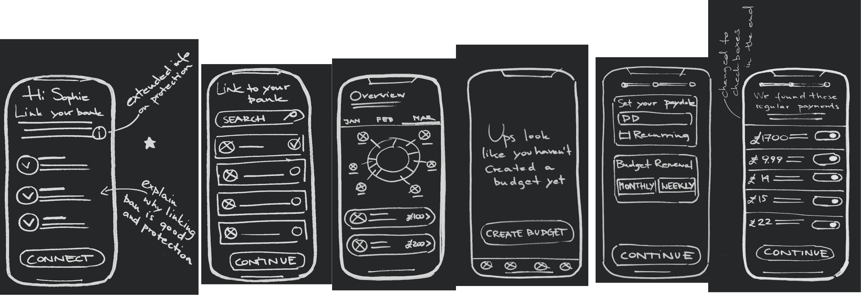
Linking the app with Sophie's bank account to track expenses, categorise spending, understand her habits, and provide her with spending suggestions.
Autogenerated personalised budget
Primary Task Flow
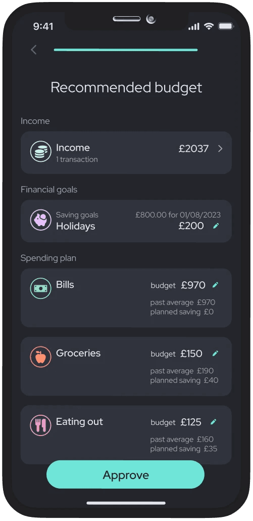
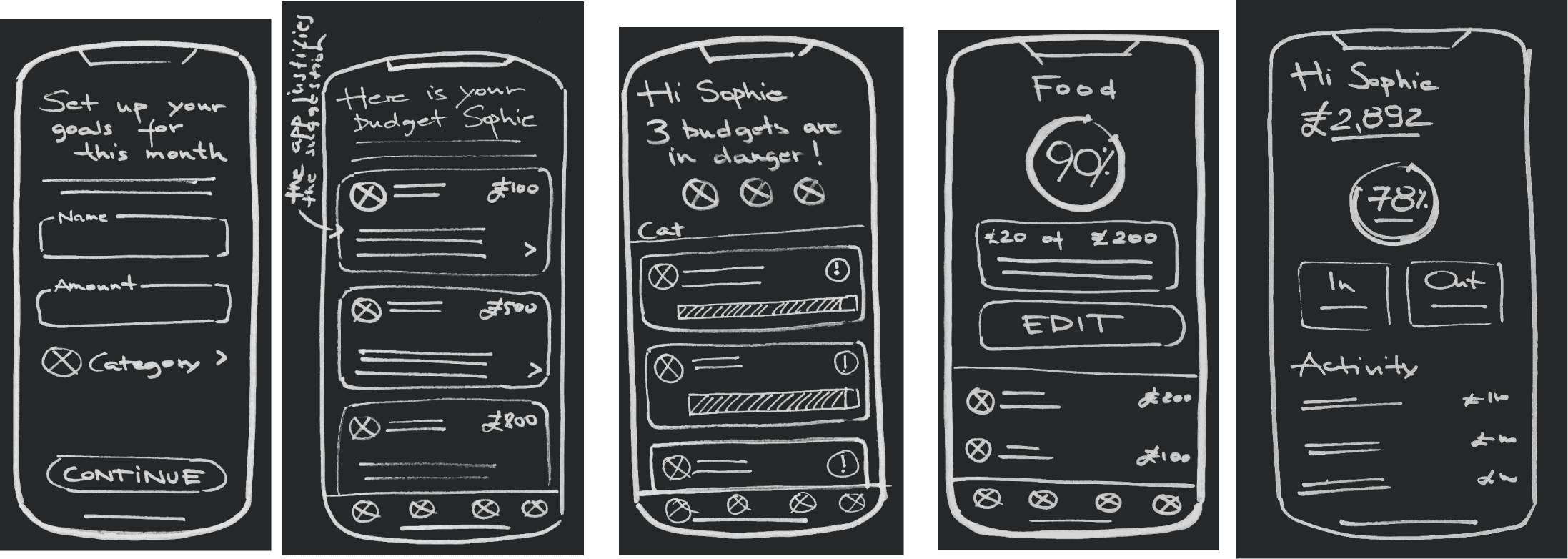
Through the use of AI, the app is able to generate a recommended spending plan for Sophie based on her past habits and the financial goals she has set for herself.
Developing solution
CAN I HOLD YOUNG PEOPLE'S ATTENTION?
While brainstorming solutions, I continually referred back to Sophie, making sure:
A) The solution would be easy for her to understand
B) The processes were quick enough to keep her engaged
C) There was a clear and easy way for her to recover if she slipped up
Usability testing
Simplifying Gone Too Far
I ran two rounds of usability testing with five participants each to gather real feedback and refine the design.
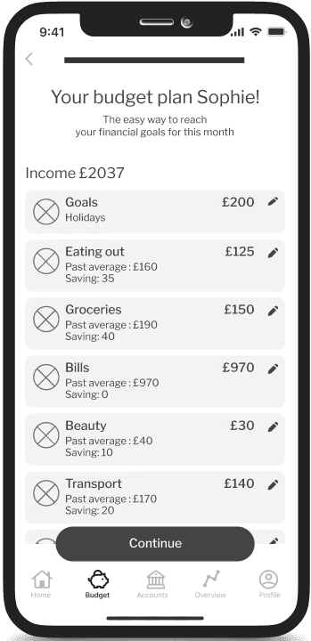
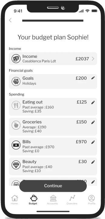
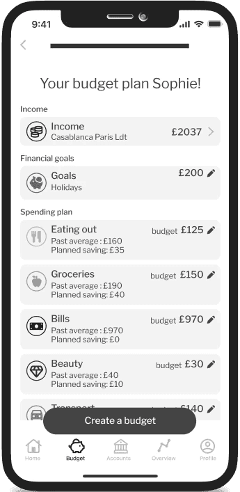
After the first round, it became clear that simplifying too much was harming clarity. Some screens lacked clear section distinctions, and users were confused without proper labels. I learned that reducing content cannot come at the cost of usability.
V1
V2
V3
RECOMMENDED BUDGET SET UP
Usability testing
Make Recovery Features
Instantly Visible
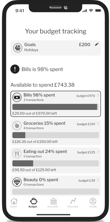
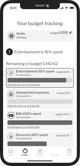
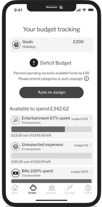
I realised users weren’t noticing the fallback ‘unexpected expenses’ category meant to support them when they slipped. It was placed at the bottom of the budget, so most missed it. By moving it to the top when an overspend was about to happen, users spotted it at the right moment.
V2
V3
BUDGET TRACKING
CHallenges
Budget Reassignment complexity
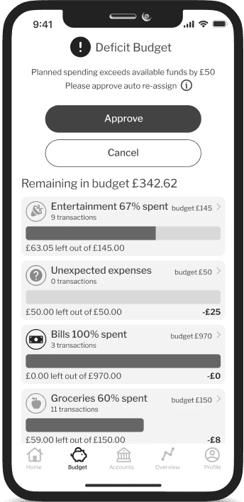
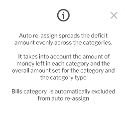
The auto-reassign feature, designed to help users adjust their budgets after slip-ups, proved challenging. Initially, it only appeared after overspending, but testing showed it needed to be accessible earlier.
I also didn’t give users enough control. They valued the feature but wanted more transparency into how their budgets were being reshuffled.
Due to tight deadlines, I couldn’t iterate on this as much as I wanted, but the learnings were clear, visibility and control are essential for building trust in automation.
V1
V2
V3
BUDGET TRACKING
Brand development
MODERN AND PLAYFUL APPROACH
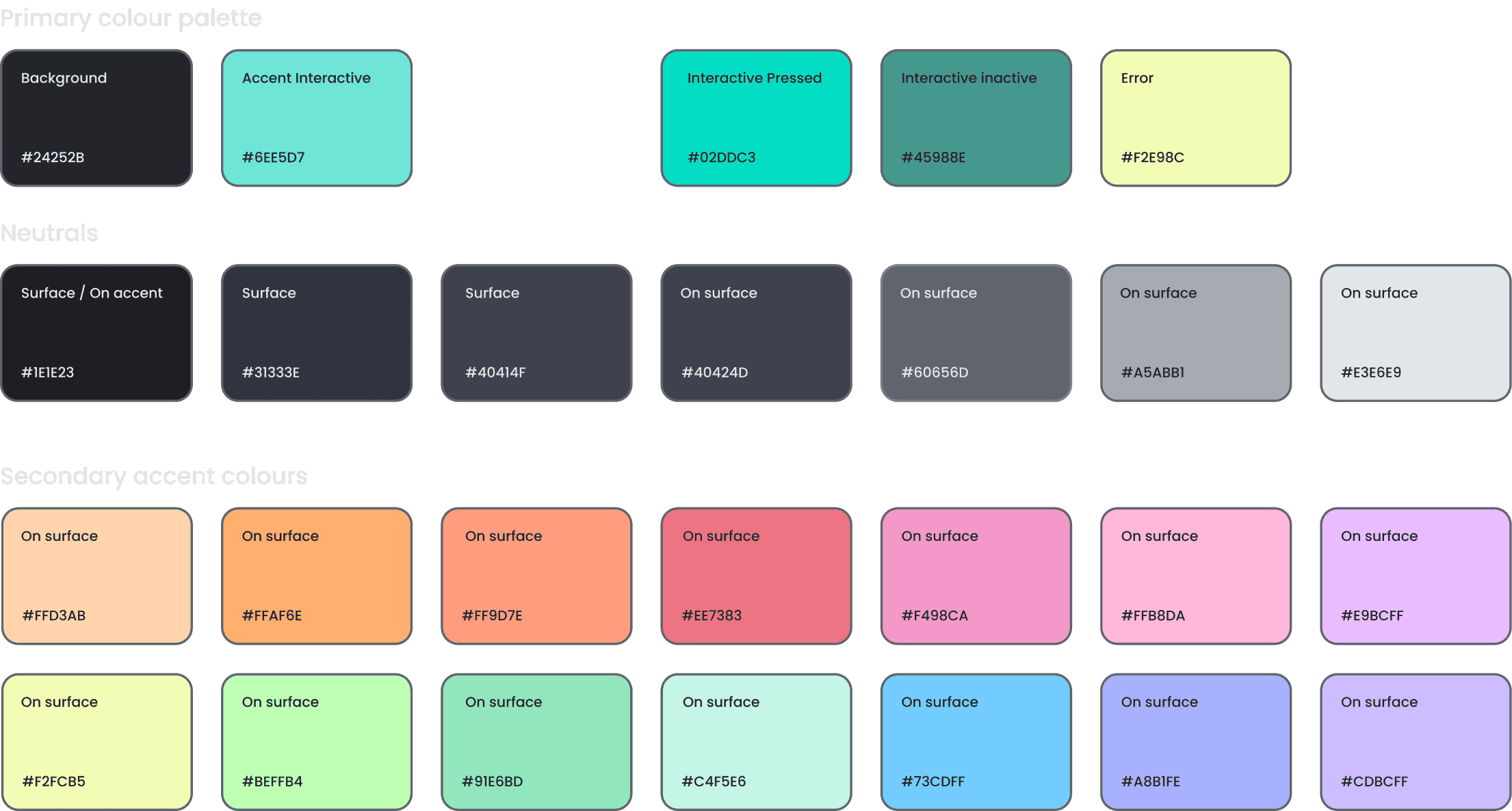
Given that my user struggles with managing personal finances, I wanted the design to feel fun, while still maintaining an elegant and harmonious user interface. I intentionally steered away from traditional banking application colours and instead opted for a contemporary and intriguing colour scheme.


High fidelity MVP
Ease and Speed
at the Forefront
tracking and
categorising expenses
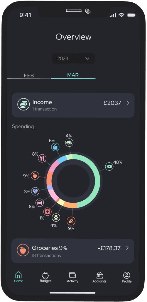
Linking bank accounts to cashu allows for expense categorising which helps the user understand their spending patterns. It also enables the app to generate feasible suggestions for future spending, so users don’t have to do the work themselves.
auto-generated
personalised budget
The user sets up their saving goals, and cashu helps create a feasible spending plan for them. No work, no second-guessing.
Staying on track no
matter what
cashu monitors users' progress, alerting them if a category is at risk and automatically readjusting the budget if necessary. The user always maintains control over their spending, even in the event of a slip-up.
Multi platform product
DESKTOP ADVANCED FEATURES
To explore how cashu could scale beyond mobile, I designed a desktop dashboard for deeper financial analysis. The layout supports more detailed breakdowns and trends over time ideal for users who want a broader view of their spending habits.
Key learnings
DESIGNING FOR SIMPLICITY,
CLARITY AND VALUE
Designing for a specific target audience
Empathising with users was crucial here. Creating a product for young adults with limited financial literacy meant keeping things intuitive, approachable, and relevant.
Simplifying language
and copy
Writing jargon-free content was harder than expected. I had to simplify complex concepts into straightforward language while keeping it informative and concise.
Iterating based on user feedback
Testing with real users revealed varying mental models around money. There was no one-size-fits-all solution but iteration helped improve clarity and usability across the board.
Balancing simplicity
and complexity
The biggest challenge was delivering value without overwhelming users. What helped was empathising with them, keeping their cognitive load in mind, and testing to strike the right balance.
