

What is tromp l'oeil?
#1
visual illusion in art, especially as used to trick the eye into perceiving a painted detail as a three-dimensional object.
#2
a painting or design intended to create a visual illusion
Goals
Translating vision to viable products
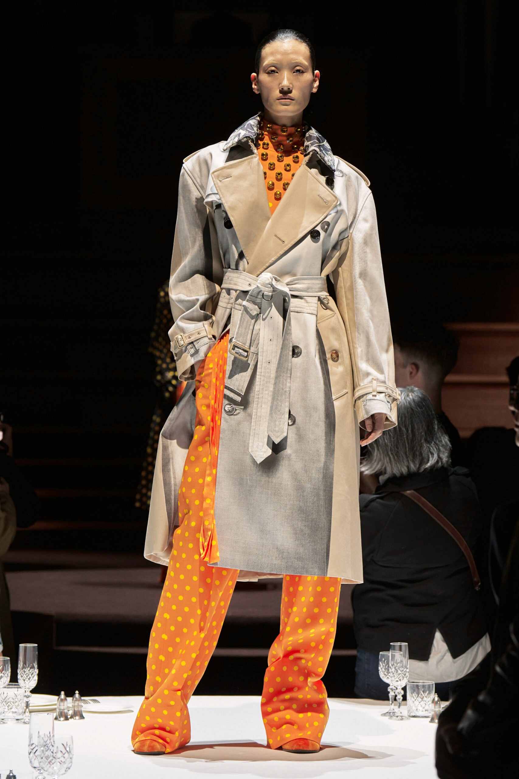
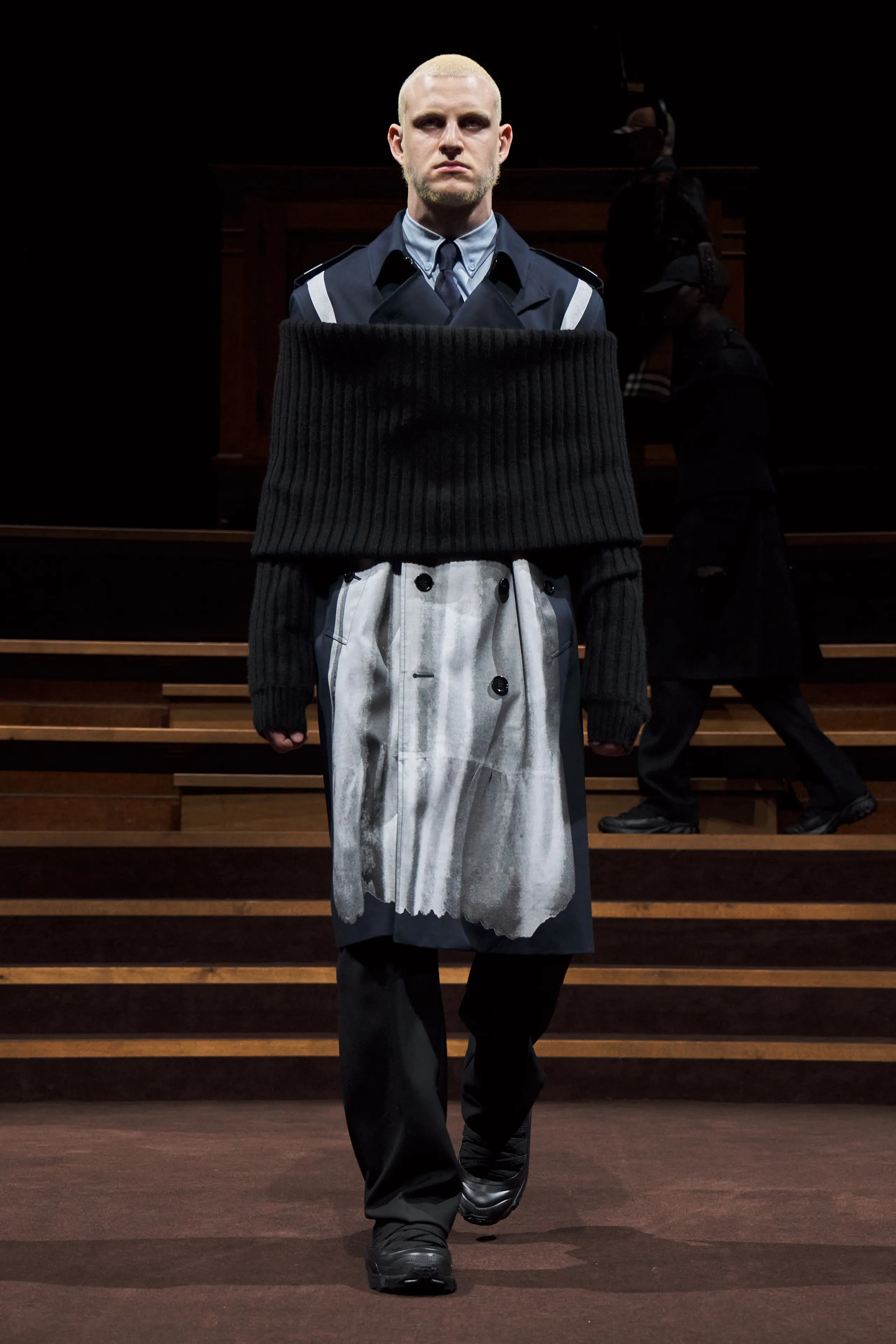
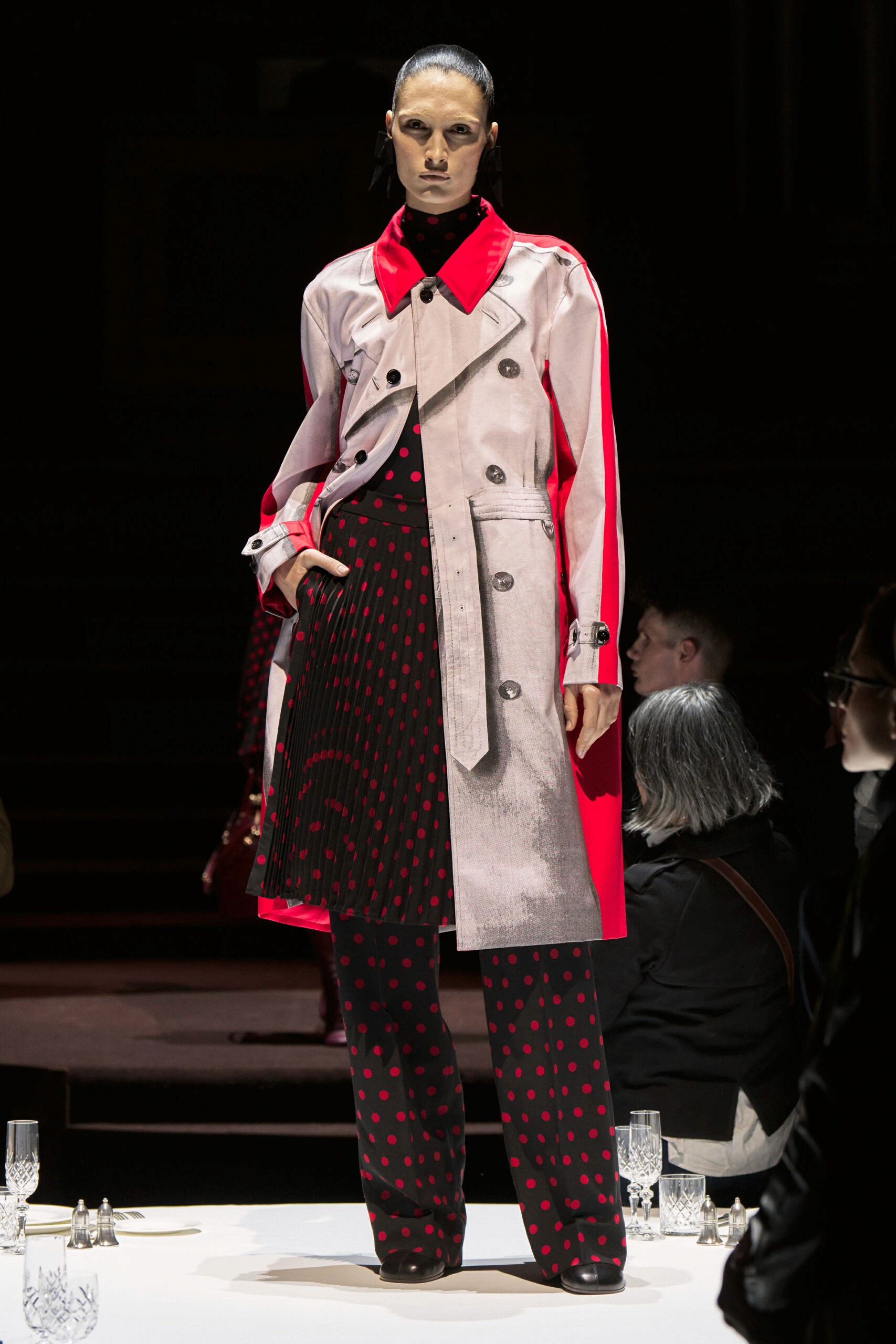
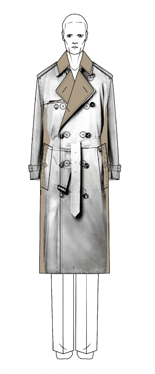
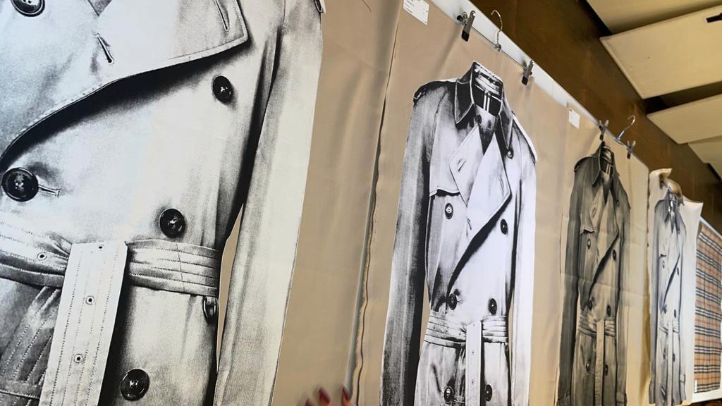
Burberry’s approach to trompe-l'œil designs focused on creating prints that gave the illusion of other garments.
The challenge was to integrate these seamlessly into the collection while preserving Burberry's high-end quality and ensuring they remained cohesive across various artworks, garment types, and fabrics.
Methodology
research aligned with Burberry’s creative vision
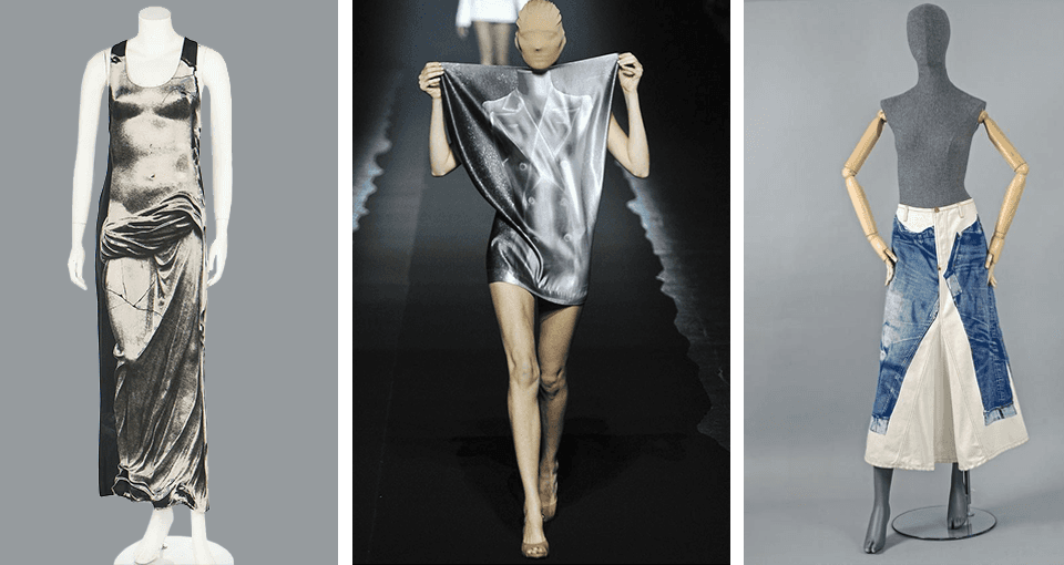
In the online research the vintage trompe-l’oeil techniques from icons like Maison Margiela, Jean Paul Gaultier, and Schiaparelli became foundational. Their legacy of using playful illusions that mimicked garments or body parts resonated with our aim - a modern Burberry garment with an experimental touch.
Visual exploration through rapid mock-ups
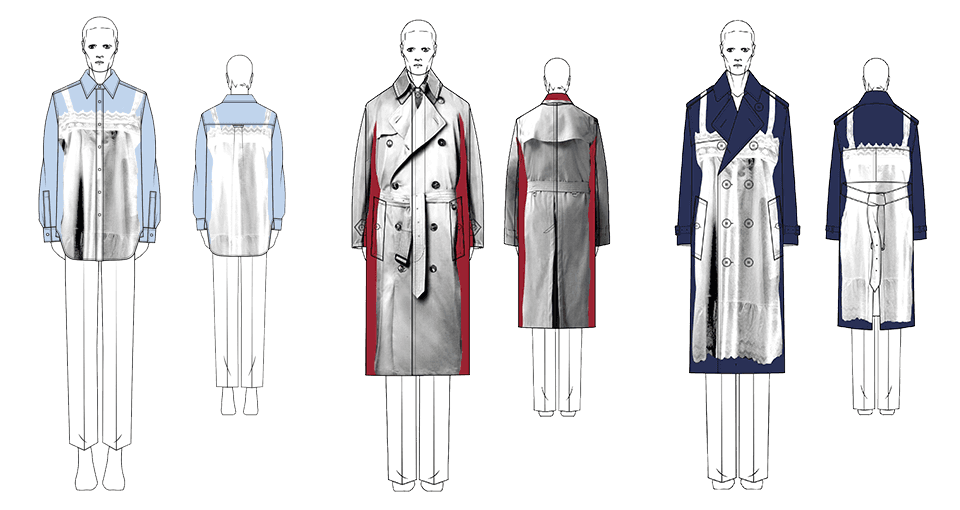
I visualised my ideas via rapid mockups on Burberry sketch silhouettes. This allowed us not only to quickly visualise potential designs but also to present a diverse range of ideas for the creative director's selection, setting the stage for the next stages of design development.
Tailoring artwork for optimal print techniques
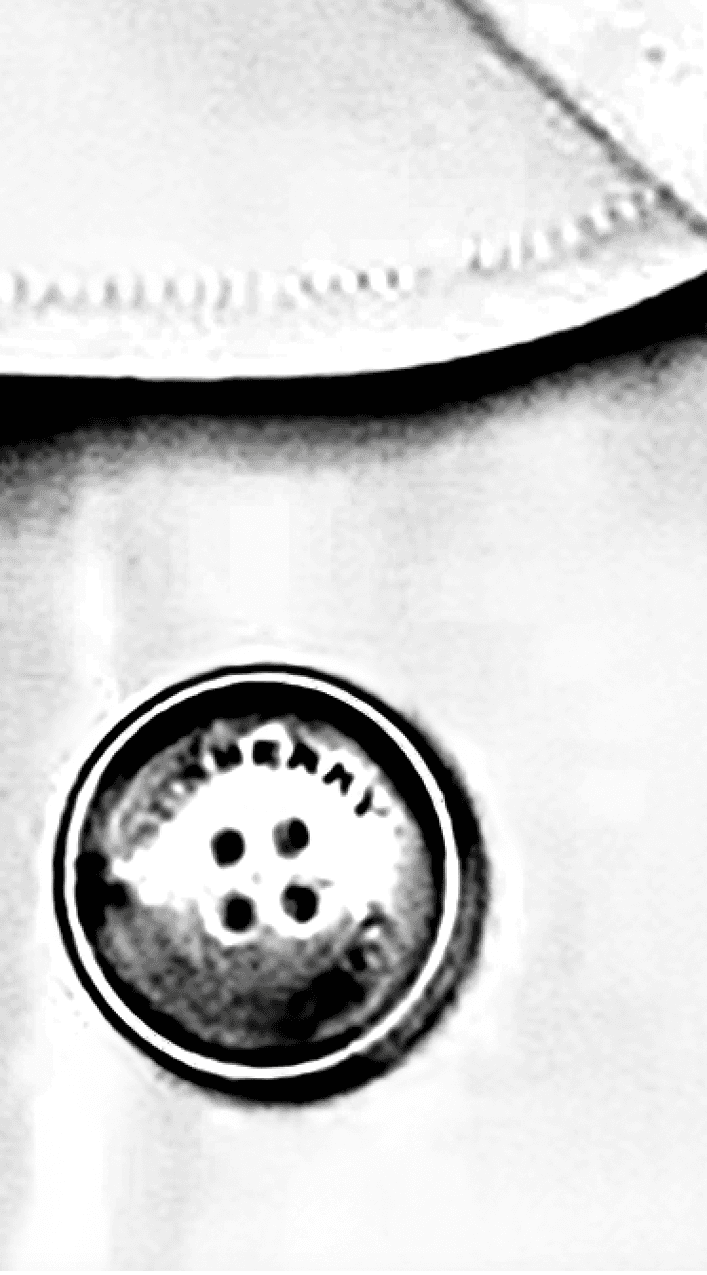
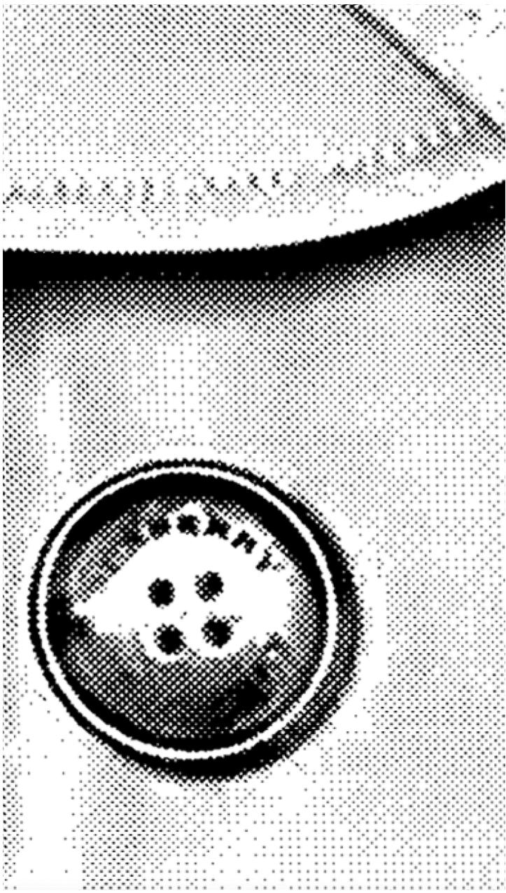
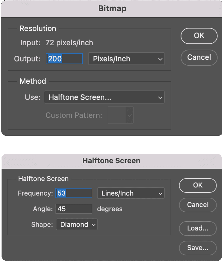
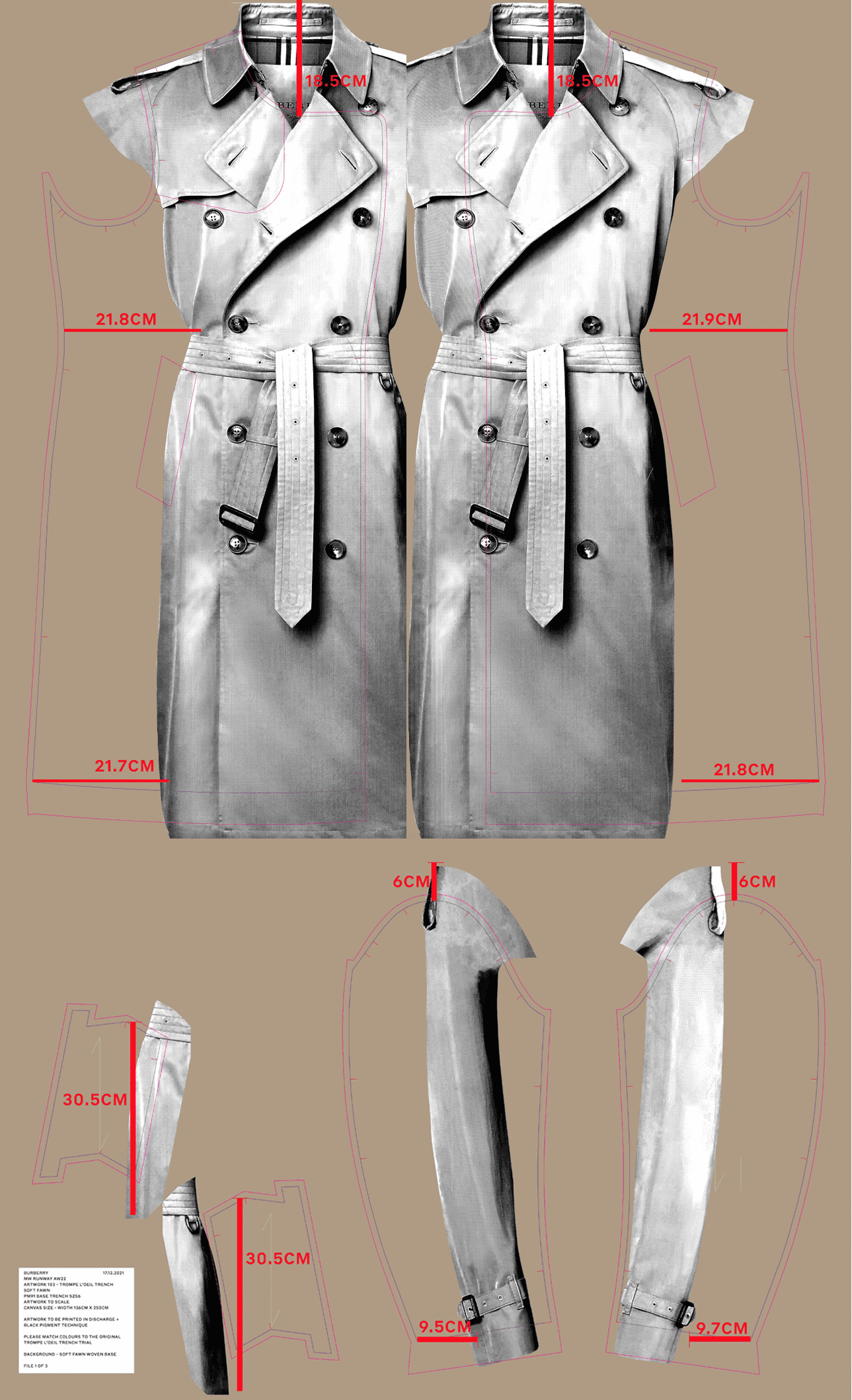
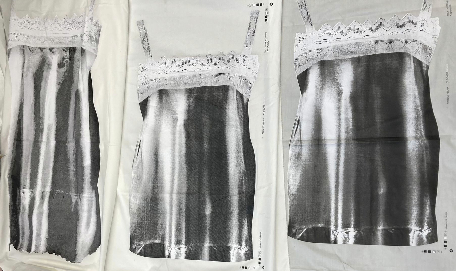
Trompe l’oeil presents unique challenges depending on factors like the chosen print technique, fabric base, and desired detail depth. Our mission was to capture grayscale artworks on coloured outerwear while maintaining a luxurious feel. To achieve this, we opted for screen printing technique.
For this technique, we needed to convert our design into a bitmap. By testing various bitmap configurations, we identified the optimal settings. This specific approach was then documented to ensure consistency in future styles.
Determining printing techniques through preliminary trials
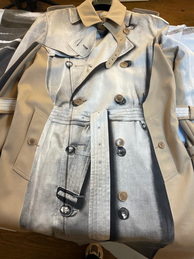
Having finalised the artwork, we launched it with the mill, requesting multiple trial runs using a range of screen printing and discharge techniques. Once the trials returned, collaborative discussions with the design team and creative director led us to select a method that combined screen printing for the black sections and discharge for the whites. This approach was chosen for its sharp appearance and a good hand feel.
For context : Discharge printing involves the application of a colour-eliminating agent, like chlorine or hydrosulfide. This agent acts to bleach out patterns, rendering them white or lighter, against a darker-coloured fabric backdrop.

Guiding the adaptation of approach for seamless print-to-garment integration
Transitioning from the conceptual stage, the next step was to align the print with the garment's pattern, ensuring it mirrored the chosen mock-up and provided a seamless appearance. While I initially oversaw this aspect, I delegated the task to a team member, offering guidance and monitoring the outcomes.
We encountered a small hiccup during this phase. The requirement to align prints on seams, necessitated specific manipulations, like warping, cutting, rotating, or clone-stamping. Given the bitmap effect applied to the trench, these alterations compromised the artwork's direction and clarity. Our solution was a shift in approach: first, we'd align and place the print using the unaltered original artwork and only after achieving a perfect match would we apply the bitmap effect.
print file
After the initial sample was positively received, the team got additional styles within the same concept and technique approved for development into garments.

Challenges
Diverse base colours in printing: Discharge technique limitations
After selecting additional mock-ups, I coordinated artwork preparation and printing trials for all fabric bases. However, the discharge technique proved ineffective on red and navy bases due to Burberry's waterproof coating on gabardine. Sourcing untreated gabardine within our tight timeline wasn't feasible.
Traditional screen printing was considered but unsatisfactory due to its heavy feel and lack of tonal gradation. In collaboration with my manager, we met with the printing mill. I proposed using smaller bitmap dots and layering white tones progressively using multiple screens. The mill team found this promising and introduced a denser screen for efficiency.
Subsequent trials improved but weren't perfect. We aimed to replicate the Creative Director's original paper artwork approval. By comparing trials to the original artwork, we provided feedback to the factory, highlighting adjustments for lightness, darkness, and paint intensity. Several iterations brought us closer to our goal, but due to time constraints, some imperfections remained, leading to compromises. The final technique was approved for production.
key takeaways
Design strategies for optimal results
Iterative design and ideation
The continuous cycle of development, presentation, and refinement is an iterative design process employed in any product development.
Visualisation & prototyping
Quick mockups and garment sampling provide stakeholders with valuable insights into the intended direction and expected outcomes.
Testing, analysing and refining
Artwork trial runs and their refinements based on feedback ensure the final product genuinely resonates with its audience, boosting satisfaction and engagement.
Cross functional collaboration
Continuous communication with technical teams, such as product developers and mills, enables the creation of more refined end products.
Solution-oriented mindset
Design projects often face unexpected technical challenges, and a commitment to finding creative solutions is invaluable throughout the product lifecycle.
Compromise and pragmatism
In dynamic environments, recognising when to compromise due to time constraints, yet ensuring a high-quality deliverable, becomes vital.
Results
Boosting show reception and brand visibility
After extensive challenges and iterations, we successfully integrated all the prints, ensuring the garments were ready for styling week. Out of these, three garments from this specific story—including both the red and navy bases—were showcased in the show. For a prestigious brand like Burberry, this is a significant accomplishment, given the meticulous quality standards and the potential for designs to be rejected.
The acceptance and success of these pieces not only underscored the quality of the work but also played a role in the overall positive reception of the collection. This achievement boosts brand visibility and augments future revenue potential for the commercial collection, as one of the styles was chosen for the campaign following the show.
project management and commitment to quality for brand value
Thank you!
Caroline Jaworsky
LET's connect
I find great joy in working with others and testing my skills in new environments. Whether you would like to collaborate on a project or simply want to chat, feel free to reach out to me.
Reach me here

