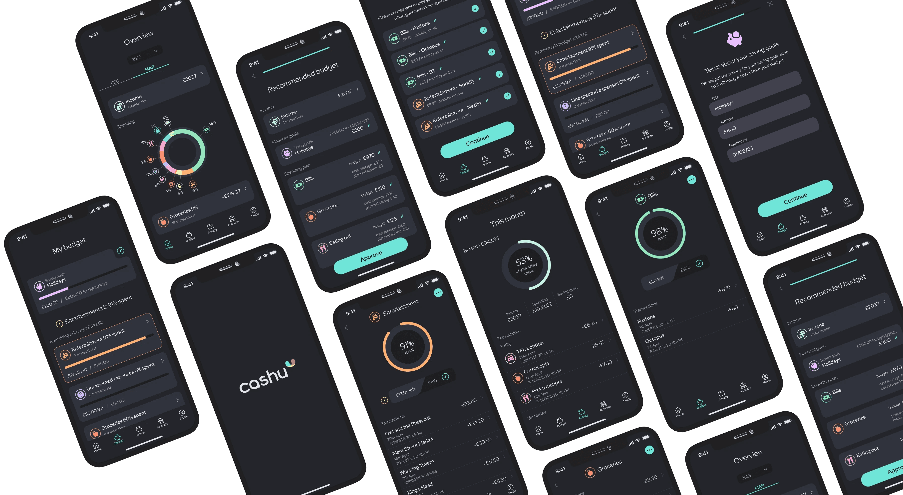
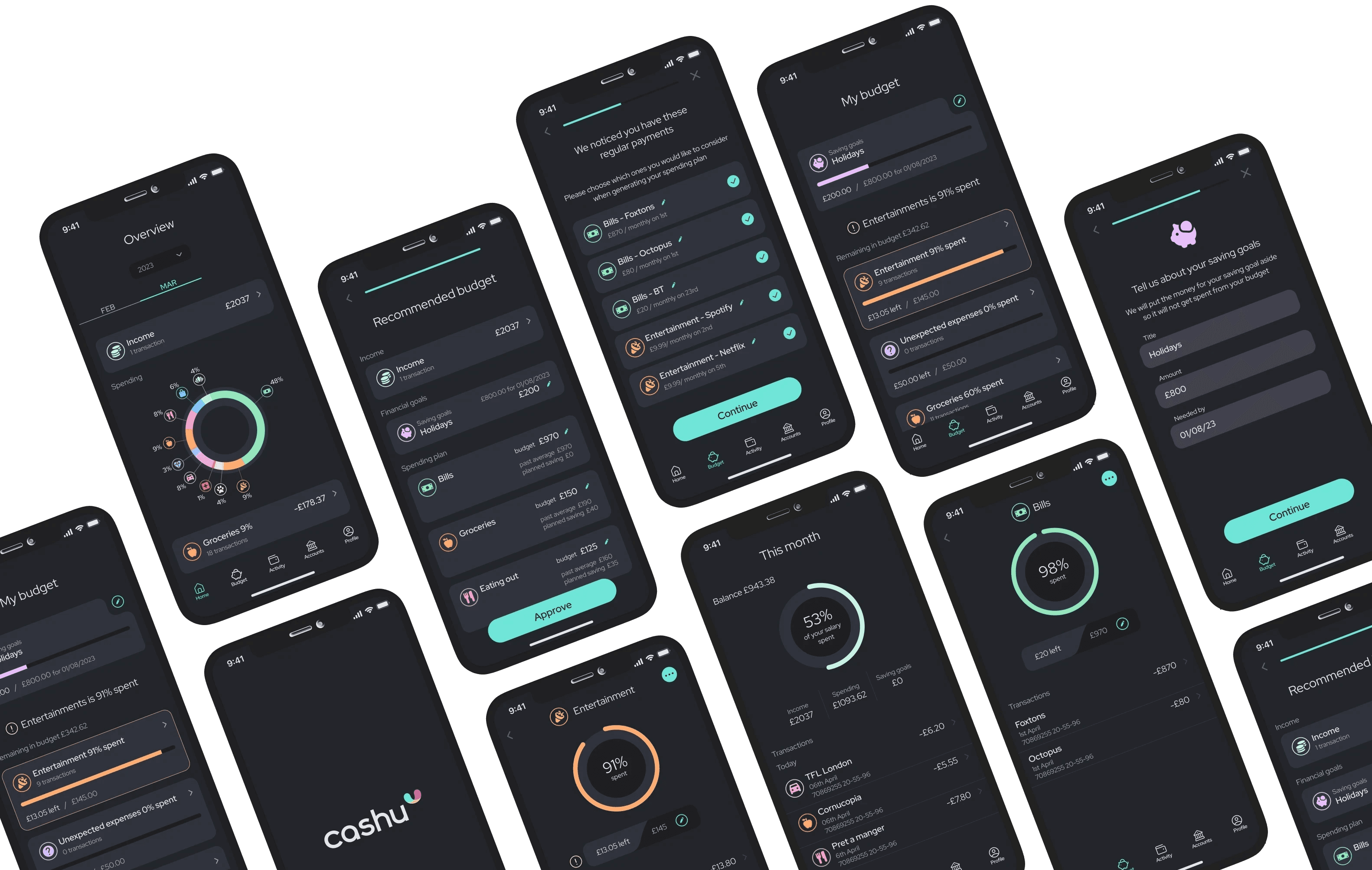
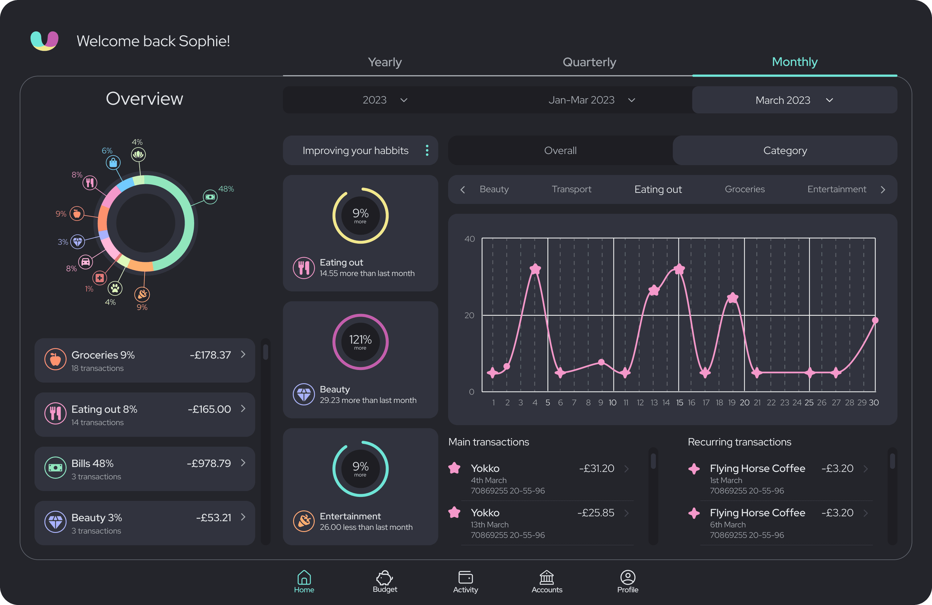
holistic platform that helps individuals to take charge of their financial wellbeing

My role
Research, UX, UI, Brand

Tools
Figma, Adobe Ai, Ps

Duration
8 weeks
The solution
HASSLE-FREE MONEY MANAGEMENT
PRODUCT
Cashu is an intuitive personal finance app that leverages machine learning to effectively manage money.
It removes the guesswork from personal finance by tracking income and expenses, while auto-generating and adjusting budgets based on user behaviour and spending patterns.
Cashu ensures that users stay on track, even when unexpected spending occurs, thanks to its automatic budget reshuffling feature.
BRAND
cashu is more than just a functional product. It is designed to be a tool that users would genuinely enjoy using.
A modern and playful, yet professional appeal aims to resonate with the young target audience.
The choice of the name, logo, typography, and colour palette all embody the essence of cashu – a fun and easy financial companion.
MARKETING
Together with cashu I designed a marketing website to promote the solution and engage with potential users.
Research
UNDERSTANDING THE LANDSCAPE OF THE PROBLEM
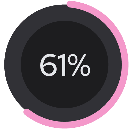
I started the project by trying to understand young people's relationship with money and their financial behaviors. I sought reliable statistics from quantitative research and studies to gain a broader view of the problem space.
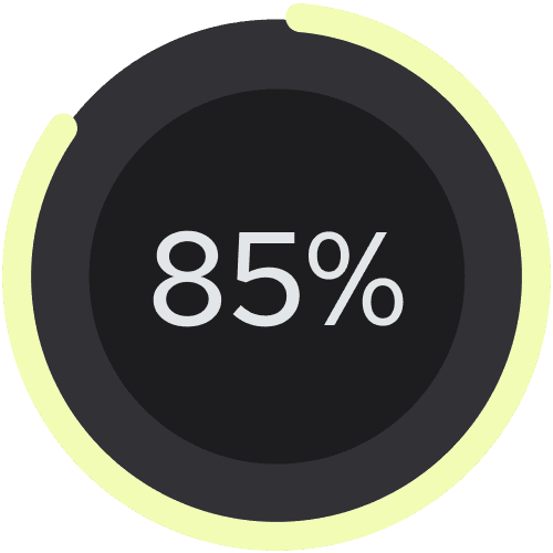
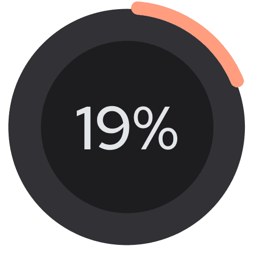
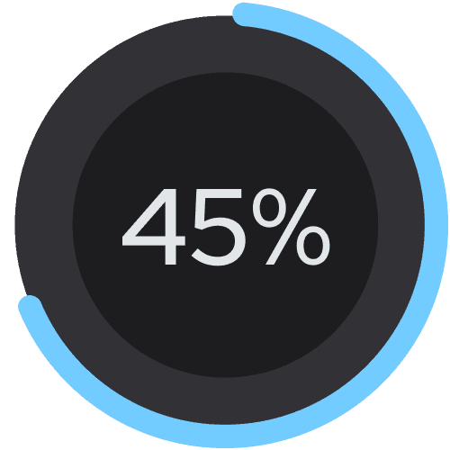
To obtain a more in-depth understanding of the problem space, I spoke to five adults between the ages of 18 and 25. My main goal was to understand in which areas of personal finance young adults struggle the most and where they need help.
Meet the interviewees *
Nigela
She is a 19 year old student who knows a few things about finance but struggles to apply that knowledge. She doesn’t plan or track her spending and often shops impulsively. She tries to put money aside but she often ends up taking it back before the month’s end.
Annabel
She is a 25 year old Print Designer who feels like it’s about time she managed her finance. She thinks budgeting, planning and tracking expenses would help her save money but she finds it difficult and always leaves it for later as she is scared of not enjoying her life.
Yanni
She is a 24 year old Occupational Therapist who lives pay-check to
pay-check. She doesn’t plan her spending and ends up taking out any money she puts into savings. She wants to get better at money management as having zero savings scares her.
*Names have been changed for interviewees privacy
Insights
DREAD OF DAY TO DAY MONEY MANAGING
Young adults don’t know how to manage their money
They see tools like budgeting, tracking expenses and planning finances ahead as important and much-needed but they find these concepts very difficult to implement.
Young adults feel very insecure about their finances
They think they aren’t handling their money well and would like to improve and increase their confidence. The number one problem for them is managing their monthly pay checks.

Persona and their journey
EMPATHETIC SOLUTIONS NEEDED
To better align my product with the user’s needs and identify opportunities for solutions, I created a journey map.
I decided to visualise what trying to manage her personal finances might look like for Sophie. Her journey begins at the start of the month when she needs to decide on a system to manage her finances, which is already a significant challenge.
It then progresses through stages where Sophie attempts to stick to a budget without suitable tools and ultimately ends with her having to move back money from her savings once more.
At the beginning of this journey, Sophie was optimistic. This feeling was quickly overtaken by a range of negative emotions.
My goal was to find a solution that could help maintain the user's positivity whilst managing their money.
Design opportunities
SIMPLIFYING MONEY MANAGEMENT FOR YOUNG USER AND MOTIVATING THEM TO STAY ON TRACK
Setting up a good plan
Automatic analysis and categorising of spending, would help to plan better. Receiving advice on what is feasible and what planning approach is suitable for the user.
Foreseeing expenses
Merging calendars would make it possible to remind the user of approaching occasions. This way they could be reminded of future expenses they need to plan for.
Option to lock
An option to be able lock a chosen amount of money away for a chosen amount of time could help to stay committed to the plan.
Competitive research
TOOLS TOO COMPLEX FOR A YOUNG CONSUMER
I wanted to understand what helpful tools might already be on the market and why younger users aren't taking advantage of them.
After assessing a few personal finance apps, I realised that even though they do offer value, they still require time and effort, which my user is not willing to expend.
Some of the products were easy to navigate, while others quite confusing. However, one aspect stood out as particularly challenging and time-consuming for users – the task of setting up their own category budgets.
Not only does this require a significant investment of time, but it also leaves room for error, especially for younger individuals who may be inexperienced in financial planning. This can easily lead to frustration and mistakes, making the entire process daunting. This area could significantly improve to better meet the needs of the younger users.
Task Flows
AUTOMATING PROCESSES TO ALLOW FOR SPEED AND EASE - AI SETTING UP THE PLAN
After an ideation phase and the creation of user stories, I determined the core functionalities of my product. Given that the scope of this project is limited to an MVP, I focused on the main features that would deliver value.
Tracking and providing insights
Preliminary Task Flow
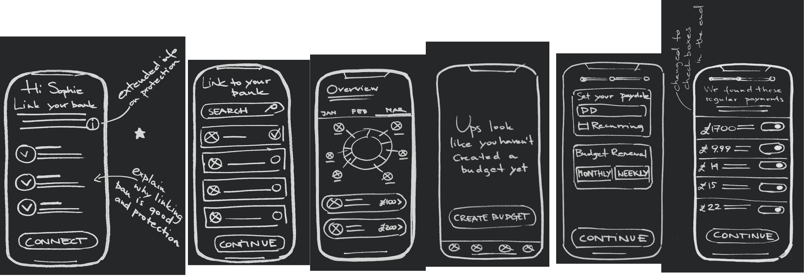
Linking the app with Sophie's bank account to track expenses, categorise spending, understand her habits, and provide her with spending suggestions.
Autogenerated personalised budget
Primary Task Flow
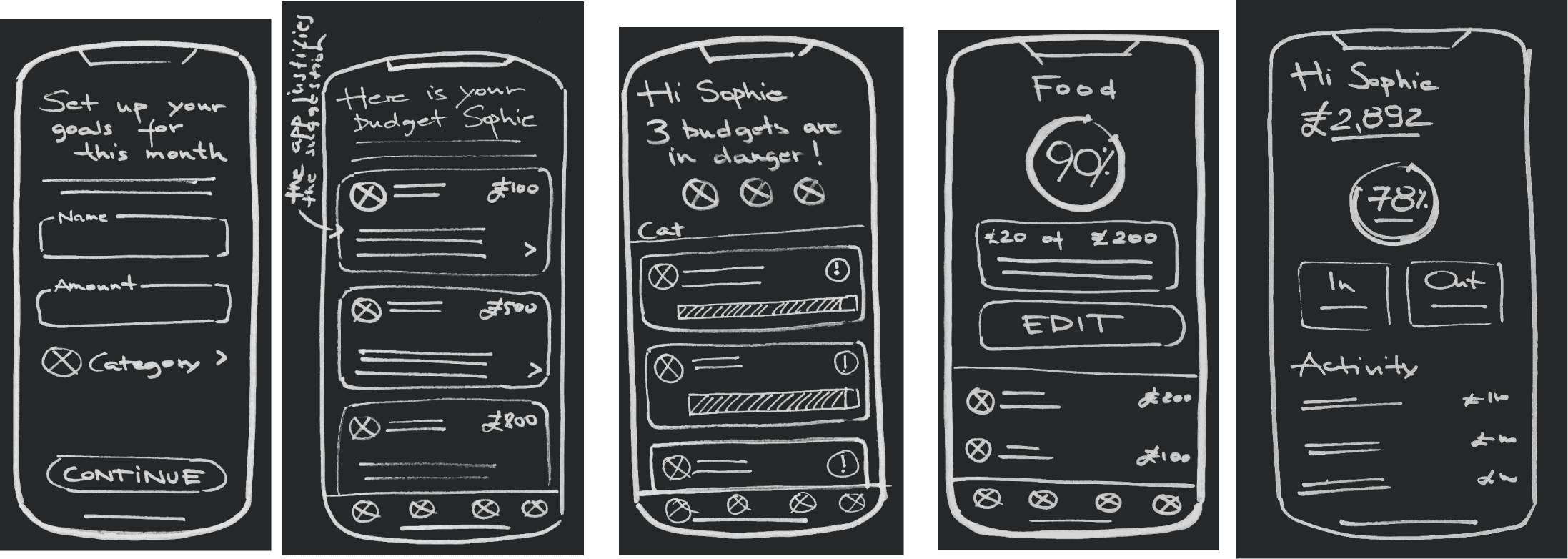
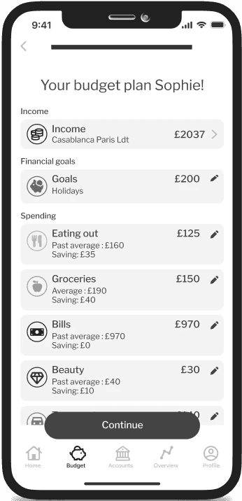
Through the use of AI, the app is able to generate a recommended spending plan for Sophie based on her past habits and the financial goals she has set for herself.
Developing solution
IS THE MVP EFFICIENT ENOUGH TO HOLD YOUNG PEOPLE'S ATTENTION?
While brainstorming solutions, I continually referred back to Sophie, making sure
A) She would find it easy to understand
B) The process is quick enough for her to be willing to sacrifice this amount of time
C) There will be an easy way for her to recover if she slips with her spending.
Usability testing
OVERSIMPLIFYING DOESN'T MAKE THINGS EASIER
As part of the design process, the prototype underwent two rounds of usability testing with five participants in each round in order to gain real-time feedback to guide the design to an optimal user experience.
After the first usability session, I realised that by trying to make the product simple, I was taking away from its usability and value.
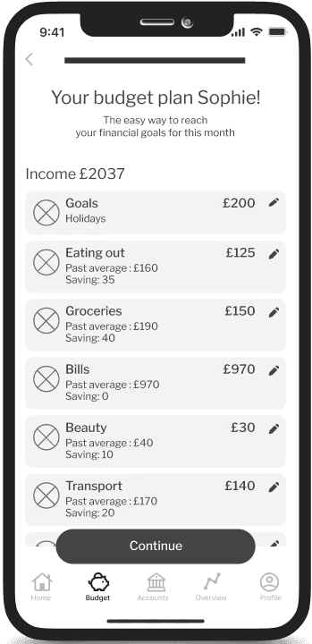
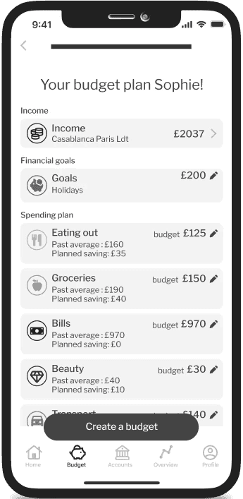
Some screens lacked distinctions between the sections, causing confusion about their purpose. To better communicate with the user, I needed additional labels or better descriptive ones. While less writing could possibly look better, my users were getting lost and confused without it.
RECOMMENDED BUDGET SET UP
V1
V2
V3
Usability testing
RECOVERY FEATURES MUST BE IMMEDIATELY VISIBLE
Moreover, I realized that even though I tried designing to help users with their slips, they were not able to recognize this in the first versions of the prototype.
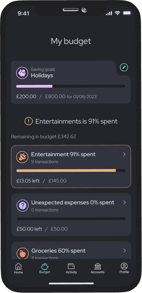
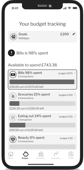
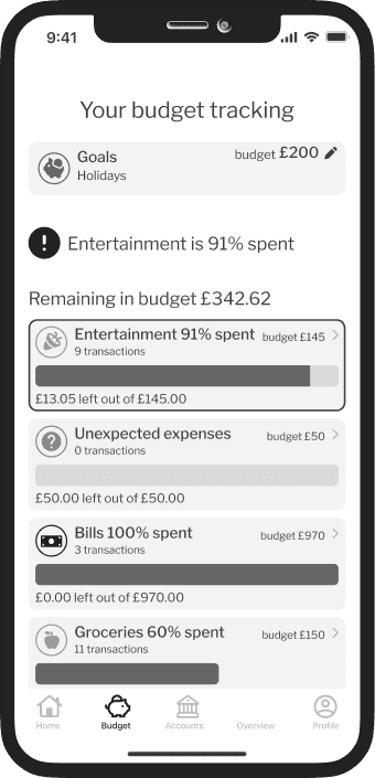
The automatically generated budget includes an 'unexpected expenses' category, designed as a fallback for when users slip or forget about something. Its original place was at the bottom of the budget categories, so most users missed it when needed. By moving it to the top when an overspend was about to happen, I drew the users' attention to it, making them aware of the possibility of using it.
This really demonstrated how quickly users expect to find what they need. If a feature or information is necessary at a given moment, it should be immediately visible.
BUDGET TRACKING
V2
V3
Usability testing
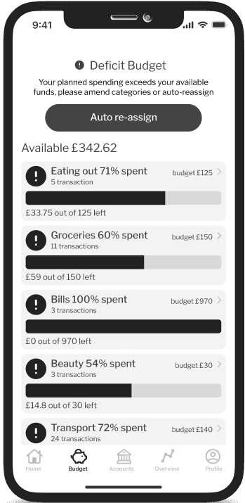
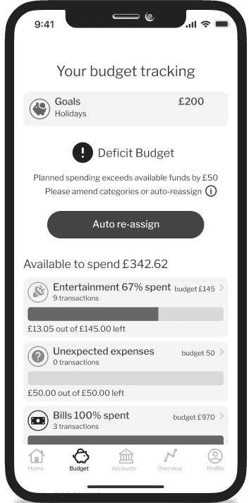
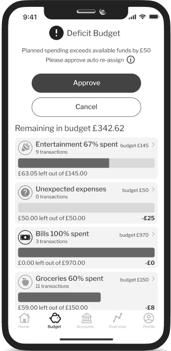
COMPLEXITY OF THE BUDGET AUTO RE-ASSIGN
Knowing my users have difficulty managing their spending, I assumed they might slip up.
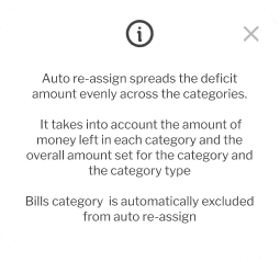
To address this, I designed an auto-reassign feature to help users amend their budgets effortlessly. However, this feature proved to be tricky and required adjustments even later in the development process.
My initial mistake was making the feature visible only when the user exceeded their budget. I realised that I should allow users to adjust their budget when increasing a category, without pushing their budget into overspend.
I also underestimated the curiosity of my users. While they appreciated the product's ability to rearrange their budget, they also wanted to understand how the feature worked and what changes it was making.
Due to the extremely tight deadlines, I wasn't able to fully develop the feature to meet my desired standards. Although there is much more that could be done here to create a better UX but due to the time constrains I couldn't devote more attention to refining it.
BUDGET TRACKING
V1
V2
V3
Brand development
MODERN AND PLAYFUL APPROACH FOR THE FINANCIALLY APPREHENSIVE YOUNG AUDIENCE
Given that my user struggles with managing personal finances, I wanted the design to feel fun, while still maintaining an elegant and harmonious user interface. I intentionally steered away from traditional banking application colours and instead opted for a contemporary and intriguing colour scheme.
Since the main target audience for the product were young people I wanted the name for the app to be short, catchy and modern.
The play on words could also create a memorable brand identity, which is important for an app in a competitive market. After much consideration, the name that I have ultimately chosen was cashu.
Cashu logo is a playful representation of a cashew nut, adding an extra layer of meaning to the play on words in the logotype. The brand colours used in the logo support an eye-catching design and have specific associations that align with the goals of a finance product: mint represents calmness, yellow represents optimism, and purple represents luxury.

Design system
MODERN AND ACCESSIBLE INTERFACE
When selecting typography, I made the deliberate choice of a non-serif font to create a modern and highly legible design. I aimed for a font that had a soft appearance, yet enough contrast between letters to ensure accessibility.

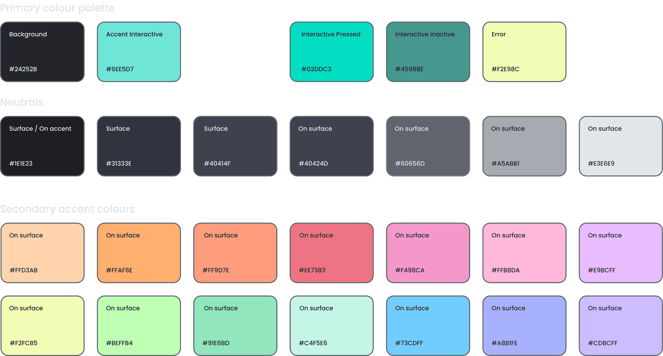
To create a sophisticated, calming and modern colour scheme for the product I used a combination of mint and dark neutrals.
To enhance the user experience, I integrated a color-coding system into my design. This facilitates easier identification of spending categories while creating a playful aesthetic.
When picking a color palette, I ensured that all colors adhere to at least the WCAG AA standard for contrast, while the main text meets the AAA standard.
Iconography and other UI elements were designed to further help the user to navigate the app with ease and stay engaged.

High fidelity MVP
EASE AND SPEED AT SOLUTIONS FOREFRONT
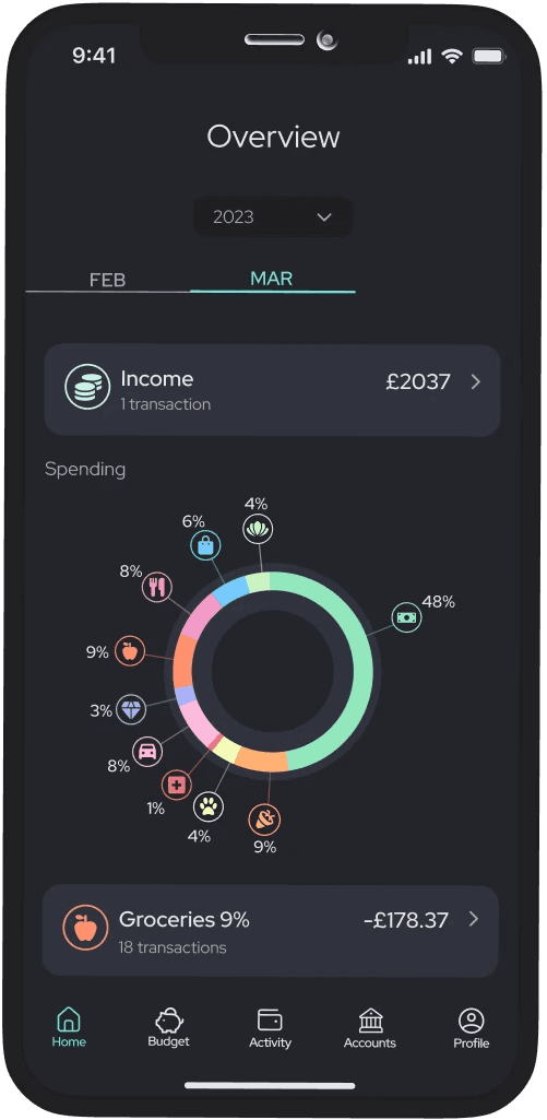
Automatic tracking and categorising expenses
Linking bank accounts to cashu allows for expense categorising which helps the user understand their spending patterns. It also lets the app create feasible suggestions for the future spending so the user doesn't need to do the work themselves.
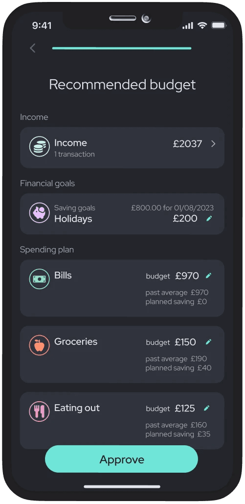
Setting up for success with a personalised auto-generated budget
The user sets up their saving goals, and cashu helps create a feasible spending plan for them. No work, no second-guessing.
Staying on track no matter what
cashu monitors users' progress, alerting them if a category is at risk and automatically readjusting the budget if necessary. The user always maintains control over their spending, even in the event of a slip-up.
Marketing website
PROMOTING THE SOLUTION AND ENGAGING WITH POTENTIAL USERS
The majority of consumers today rely on the internet to research and purchase products. As is essential for a product to have online visibility I have created a marketing website to promote cashu.
Multi platform product
MAGINING THE SOLUTION ON A DIFFERENT DEVICE
As a part of this project I was tasked with considering a platform that could enhance the value of my solution.
I believe that cashu has the potential to offer more advanced features through desktop applications. The larger screens of desktop devices allow for additional space, enabling more detailed analysis. With this in mind, I have created a desktop view of the cashu homepage.
Key learnings
BALANCING SIMPLICITY, CLARITY AND VALUE FOR YOUNG ADULTS IN PERSONAL FINANCE
Designing for a specific target audience
As my app was meant for young adults who might not have much experience with personal finance, I had to create a product that was easy to understand and use while still providing value to them.
Simplifying language
and copy
Using language that was understandable for my target audience was challenging. I had to simplify the language and avoid using jargon while still focusing on the most important information.
Iterating based on user feedback
As I tested my prototype with a diverse group of users, I found that everyone had different ways of thinking about their finances. This made it difficult to design a one-size-fits-all solution. However, by gathering feedback and iterating on my design, I was able to improve my product.
Balancing usability and complexity
I wanted my product to be easy to use but comprehensive enough to provide value and help users achieve their goals. Finding the balance between these two factors requires consideration of the user experience, the features and functionality, and the overall design of the product.
UX metrics
DO USERS FIND CASHU EASY AND HELPFUL WHEN MANAGING THEIR FINANCES?
Since cashu is an academic project that hasn't been launched for users to experience, the metrics are currently theoretical. However, it is still important to consider how to measure the design's success and users' experiences with it.
From a marketing standpoint, monitoring the number of cashu downloads, the count of active users, retention rate, and Net Promoter Score (NPS) would be valuable metrics to gauge success.
To gain insights into users' experiences and evaluate if cashu successfully achieved its goal of being easy and valuable for young people, additional tools would be needed.
Evaluating the rate at which users successfully complete key tasks, such as creating a budget, would give valuable insights into their overall success and could be quantified using a Task Success Rate metric.
Using the System Usability Scale (SUS) to evaluate cashu's user experience would provide valuable data on users' perceptions of the platform's usability. It would help to identify areas for improvement and inform design decisions that prioritise an easy and straightforward experience for young individuals managing their finances.
Conducting small surveys would be advantageous in assessing the perceived value of the cashu. Questions regarding whether cashu helped users better stay on top of their finances and if managing their finances became easier can provide valuable feedback. It would be recommended to conduct the survey to users who have been actively using the app for at least a month to ensure meaningful insights.
The data collected would serve as a foundation for ongoing enhancements and iterative design decisions. These insights could be leveraged to fine-tune cashu, making it even more intuitive, effective, and aligned with the financial needs of young individuals.
